NOM-NOM | AI RECIPE APP
An AI recipe app that makes cooking quick and approachable for busy students and beginner cooks.
Jan 2024 – May 2024
UX Designer/Illustrator
Figma, FigJam,
Adobe Illustrator
Leads: Azaan, Abby
Designers: JunHa, Sam, Nathan, Sam
For college students and young adults living on their own, cooking can feel overwhelming. Between school, jobs, and packed schedules, there’s often little time—or energy—to plan meals. Many are new to cooking and struggle to find recipes that are realistic, quick, and fit their lifestyle. We noticed most recipe apps don’t support this need, often offering generic or time-consuming meals that don’t work for busy, inexperienced cooks.
Young adults and students struggle to cook because of limited time, low experience, and busy schedules.

Offer quick, easy recipes that are personalized to fit users’ time, diet, and cooking skills.

We focused a lot on emulating the UI of nom-nom and on advanced prototyping and creative illustrations. After multiple rounds of feedback on our designs here were the final results!
- {{ item.text }}
We started by looking into what helps people decide to cook in the first place. Across articles, forums, and user feedback, we kept seeing the same themes: ease, speed, and flexibility. Recipes felt approachable when they could be made with minimal effort, in a short amount of time, and without needing a trip to the store.
“I just want something quick that doesn’t make a mess or require a ton of steps.”
We looked at top recipe apps to understand what features they offer and where they fall short. Many lacked personalization and tools that support busy or beginner users. This helped us identify key gaps and shape our solution around flexibility, simplicity, and user-specific recommendations.






We interviewed 20 cooking app users (mostly students and young adults) to learn more about how they approach cooking. We asked about meal planning, cooking habits, dietary restrictions, and how they usually find recipes. Through these conversations, we noticed a few common insights.
But why was this the case?
Users tend to prefer recipes that are easy to follow, value preparation time and ingredient availability.
Students get discouraged by long or complicated steps. They felt quick prep and simple ingredients make cooking more doable.
Users tend to take a spontaneous approach to cooking, choosing recipes by current taste preferences, or grocery shopping instinctively without a set list.
Many decide what to cook last minute, based on cravings or whatever they bought without planning ahead.
Users generally don’t trust AI in generating recipes, but they would use it to consolidate recipes to a more digestible format and recommend dishes.
Students doubt AI-generated recipes but like when it simplifies choices or suggests substitutions.
Users value videos for guidance, but face difficulties multitasking when following recipes.
Students learn better with videos, yet struggle to pause or multitask when following them in real time.
We looked at students’ cooking habits, motivations, and challenges. To capture their needs, we created personas and journey maps that showed common frustrations, moments of hesitation, and ways Nom Nom could make cooking easier and more enjoyable.
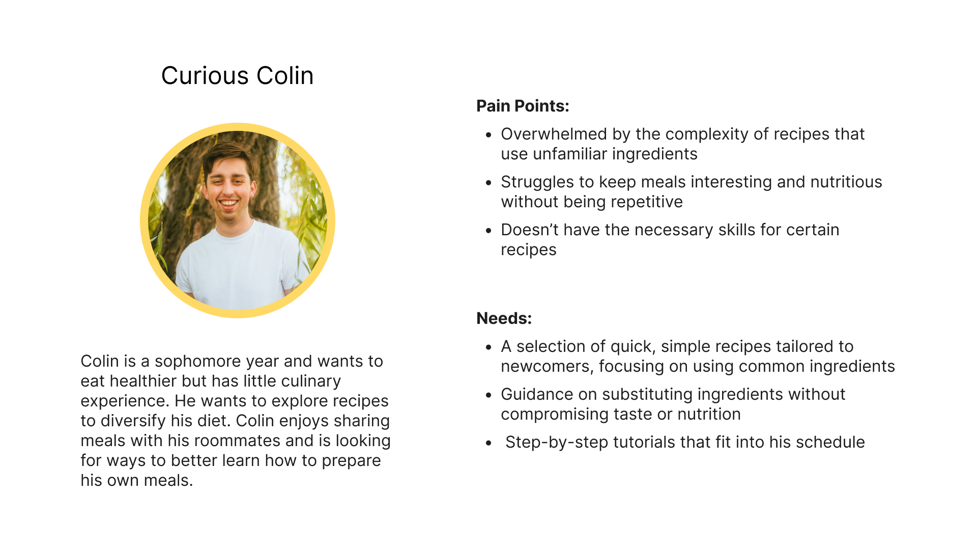
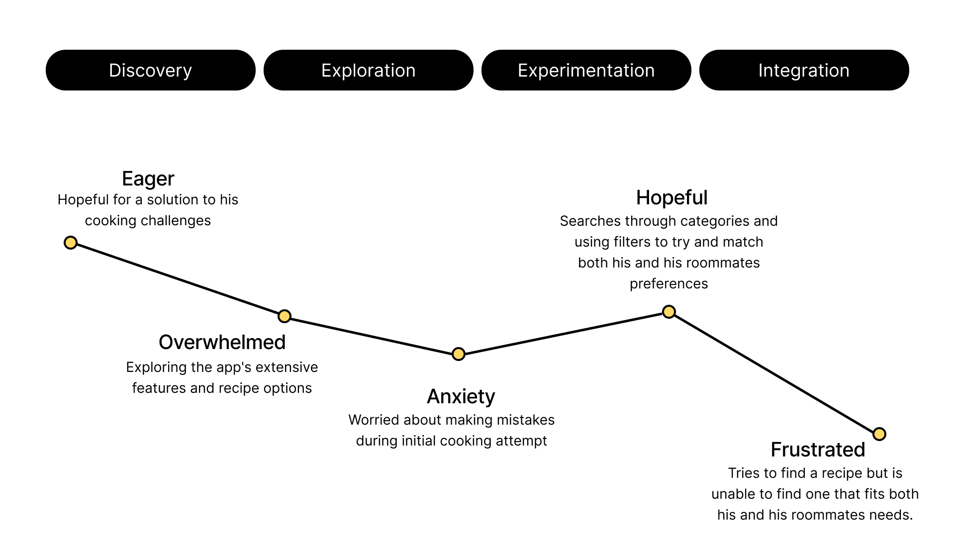
Our first fictional user Colin, likes trying new meals but often feels unsure. He needs quick, flexible recipes that match his schedule and skill level. By offering clear steps and customization, Nom-Nom can help him stay confident and engaged.
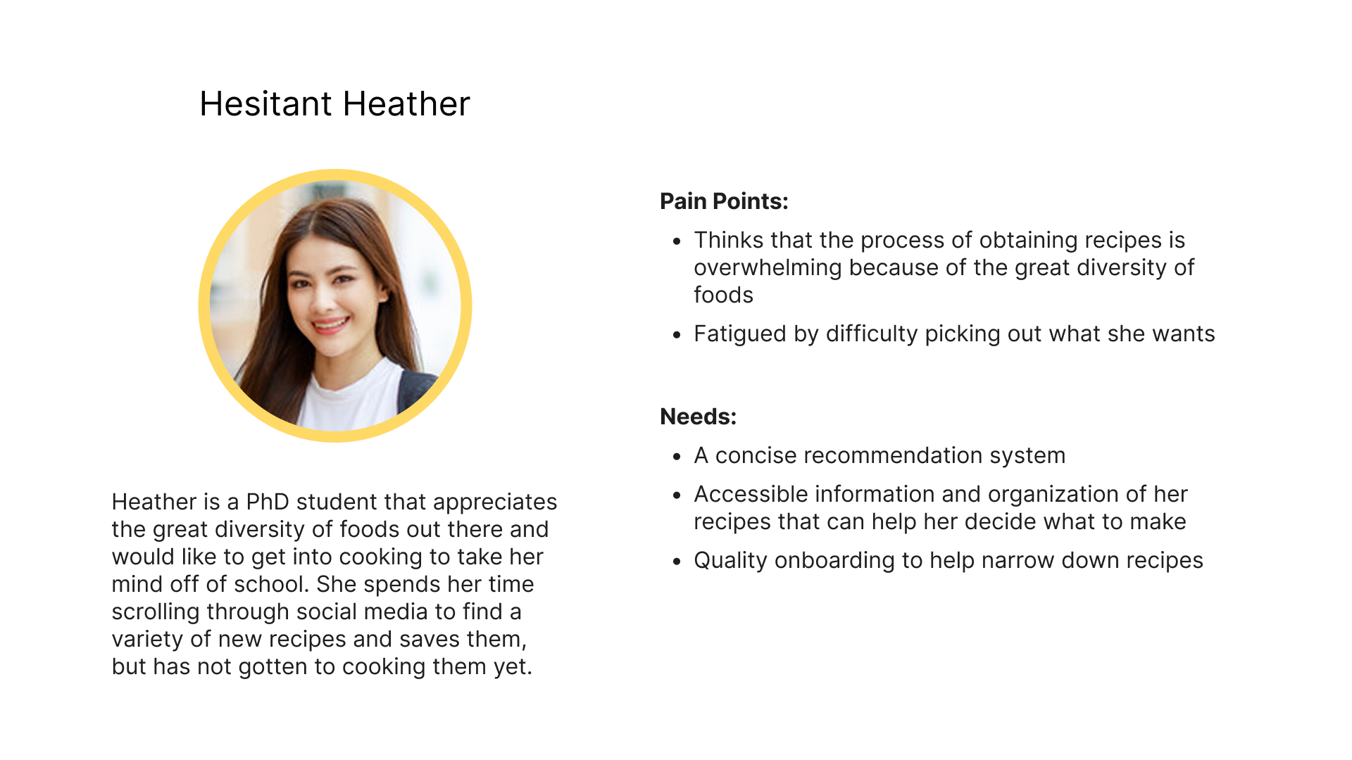
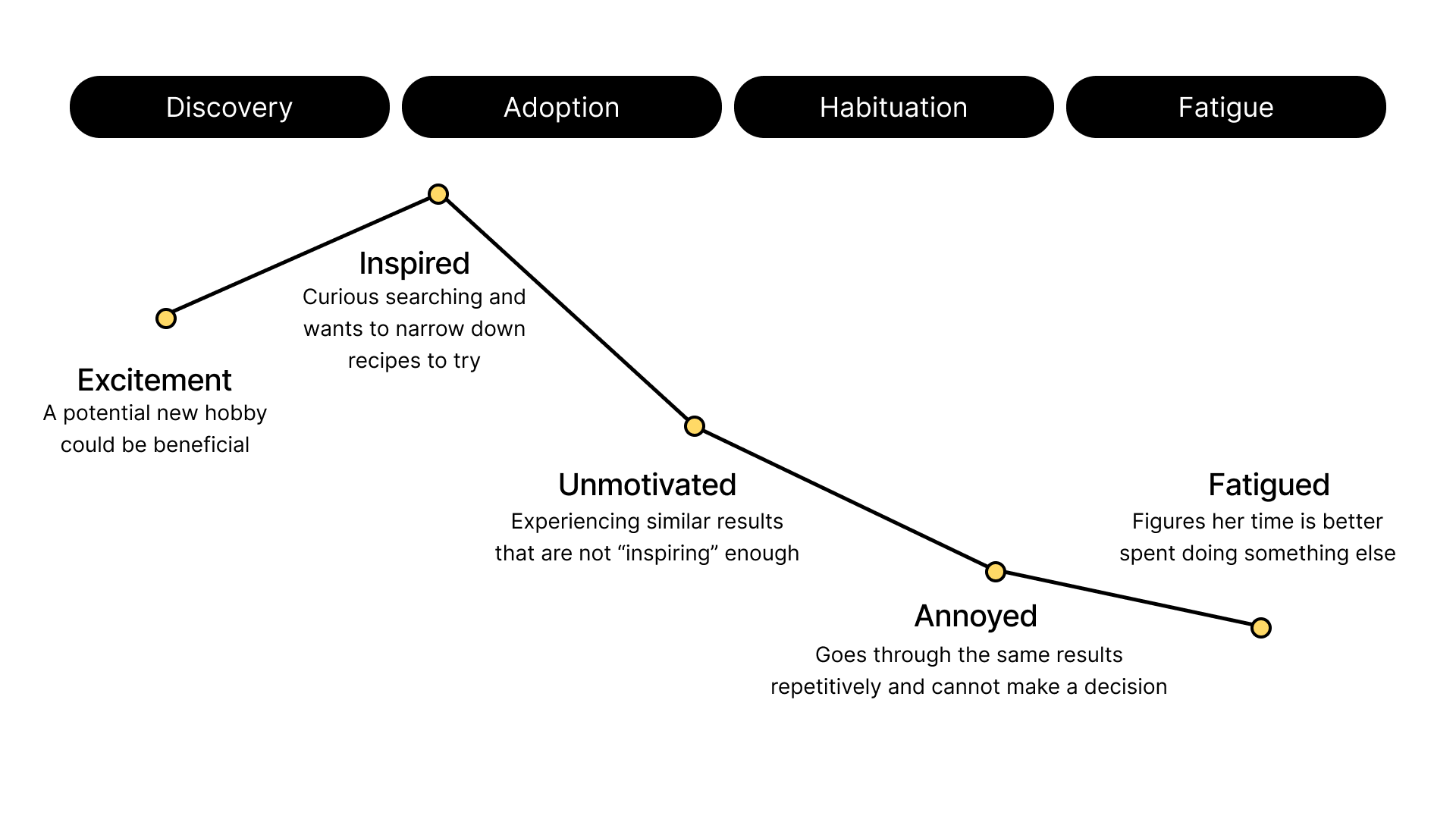
Our second fictional user, Heather, wants to cook more but feels intimidated. Complicated recipes with too many steps discourage her. By giving simple, approachable recipes with small wins, Nom Nom can help her gain confidence and build consistent habits.
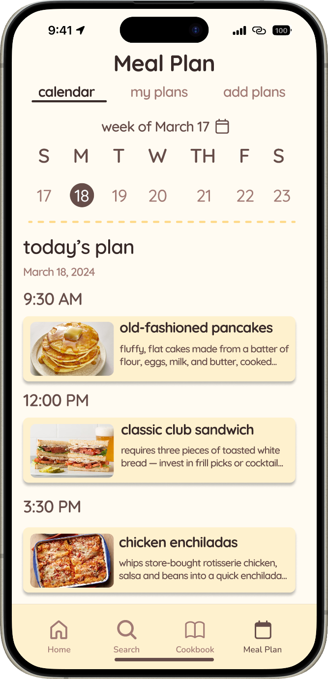
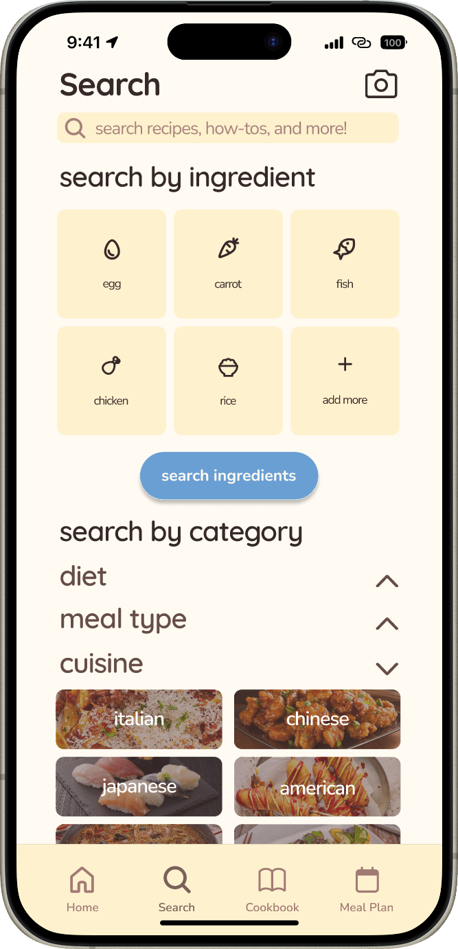
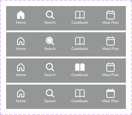
Our app is structured into four main tabs—Home, Meal Plan, Cookbook, and Search—each designed with clear, intuitive information architecture to deliver personalized recommendations, efficient meal planning, easy recipe organization, and advanced filtering, ensuring a seamless user experience informed by competitor insights and user needs.
Working from the insights, each of us sketched flows for the screens we owned. Rough passes let us compare navigation ideas quickly before committing to structure.
We focused on creating a cohesive brand identity that feels approachable and welcoming for all users. The design emphasizes clean layouts, clear navigation, and friendly visuals so that even beginners can easily engage with the app. By prioritizing inclusivity, the branding ensures the app is accessible and enjoyable for a wide range of users.
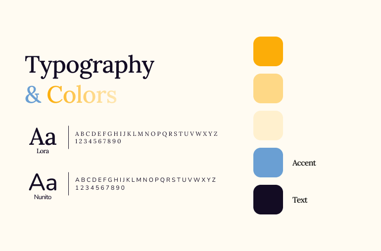
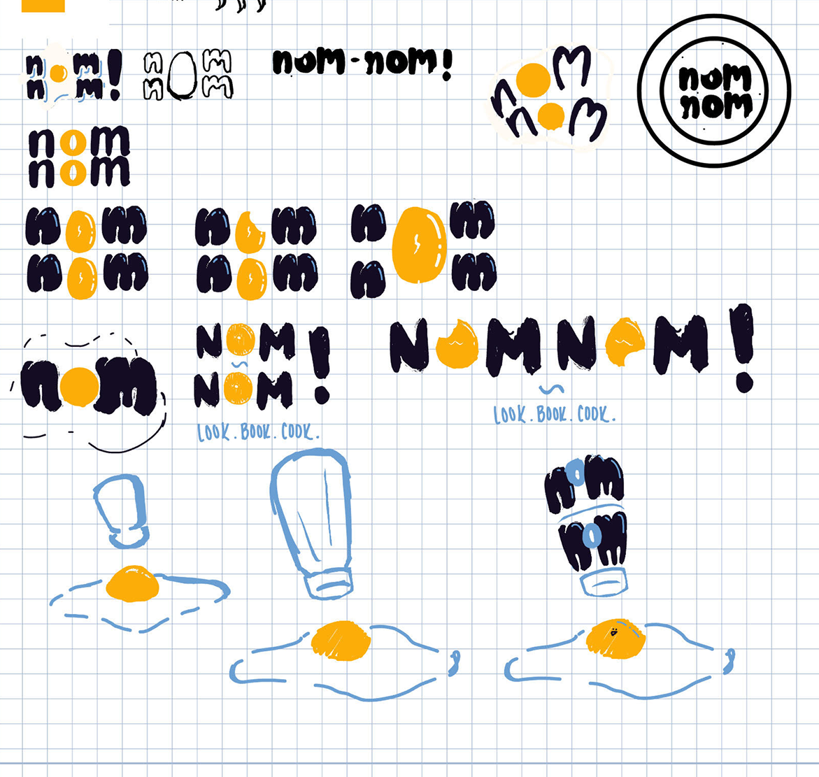
We chose typography that is clean and easy to read, helping users stay engaged while matching the modern style of our overall brand. We also designed a logo using a similar style to keep the identity consistent.

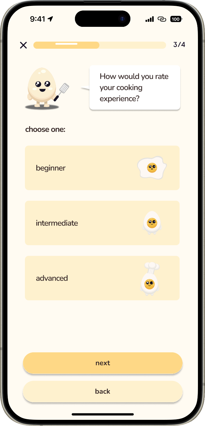
We added a character to act as the AI assistant, making the app feel friendlier and more interactive. This character guides users and personalizes the experience, helping it feel engaging instead of mechanical.
We chose a vibrant, inviting color palette that encourages users to explore the app often. The colors were designed to spark appetite and creativity, making cooking and meal planning feel more enjoyable.
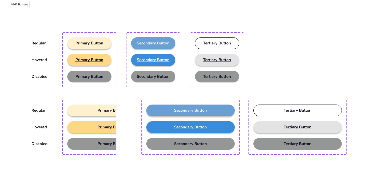
We explored different button styles and states to ensure clarity and consistency, while also creating a simple navigation bar that keeps core features easy to access. Together, these components form a cohesive system that feels intuitive and user-friendly.
To bring our ideas to life, we started with low-fidelity grayscale wireframes, focusing on how users might navigate the platform. In our first round of usability testing, we used a think-aloud process with 20 participants, which revealed key usability pain points and opportunities to simplify interactions.
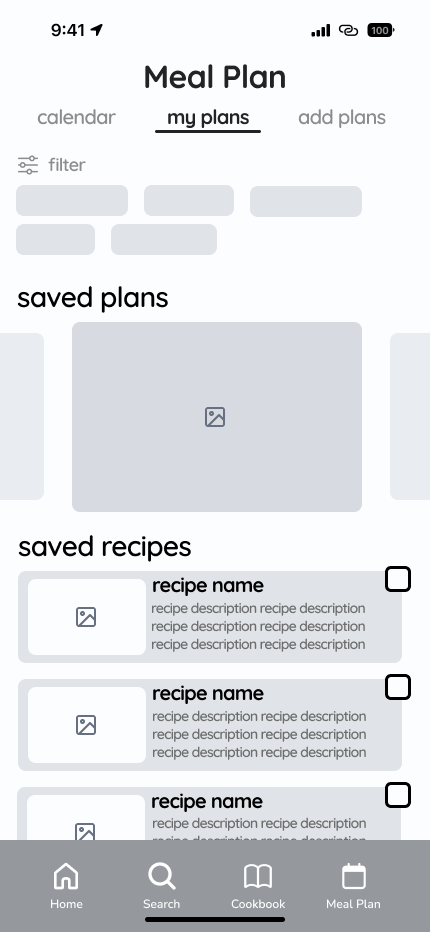
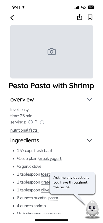
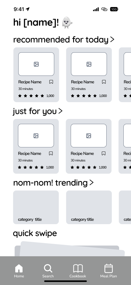
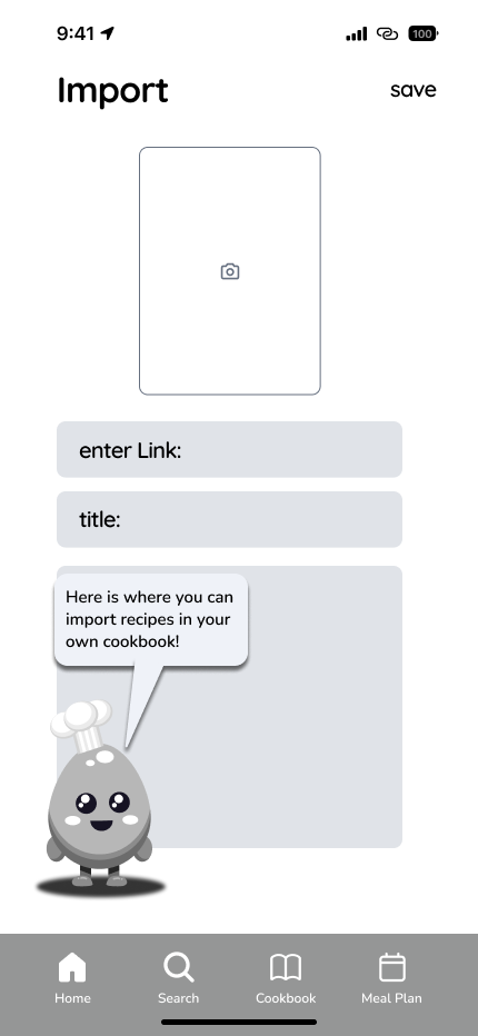
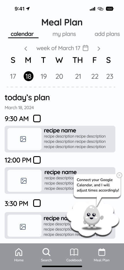
Too many options appeared at once without enough filtering controls.
The layout made it hard to distinguish between saved recipes and suggested ones.
Items weren’t grouped by category (e.g. produce, dairy), making grocery planning harder.
Users wanted more guidance on how to use key features like weekly planning.
We followed up with high-fidelity wireframes to simplify navigation and create clearer pathways for meal planning to ensure the app feels approachable and useful for college students.

We received a wide variety of suggestions from users, often with conflicting needs. Choosing which feedback to act on first was a challenge, since every change had the potential to affect the overall experience in different ways.
During sessions, many testers spent most of their time on recipe details instead of navigating the broader planning flow. This made it harder to understand whether features like the weekly planner or shopping list were intuitive.
Redesigning the shopping list and meal planner took several rounds of adjustments. Fixing one issue often revealed another, which forced us to carefully balance clarity, usability, and functionality.
Everyone brought strong ideas to the table, but it wasn’t always easy to agree on a final direction. Learning to compromise, communicate clearly, and lean on research helped us move forward and build a more cohesive product.


I had never done proper prototyping before; however, I took this step forward to learn and explore to better see the product come to life while becoming more confident in my abilities as a designer.
I stopped shying away when confused or struggling, which provided direction and also strengthened my own creativity and ideas.